Render Layout Template
How it Works
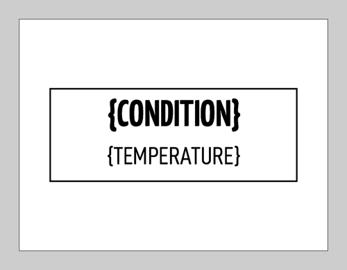
SyncSign uses the “Render Document” created from the “Layout Template” to render the content of the screen.
Here is an example of a layout template:
{
  "background": {
    "bgColor": "WHITE",
    "enableButtonZone": false,
    "rectangle": {
      "strokeSize": 2,
      "fgColor": "BLACK",
      "block": {
        "x_percent": 10,
        "y_percent": 30,
        "w_percent": 80,
        "h_percent": 40
      }
    }
  },
  "items": [
    {
      "type": "TEXT",
      "data": {
        "font": "YKSZ_BOLD_44",
        "block": {
          "x": 88,
          "y": 90,
          "w": 304,
          "h": 56
        },
        "text": "{CONDITION}"
      }
    },
    {
      "type": "TEXT",
      "data": {
        "font": "DIN_CON_32",
        "block": {
          "x": 88,
          "y": 140,
          "w": 304,
          "h": 56
        },
        "text": "{TEMPERATURE}"
      }
    }
  ],
  "options" : {
      "pollRate": 5000,
      "refreshScreen": true
  }
}
This layout template will create an image on the screen as below:
Layout template contains:
Status (Mandatory if the data source is calendar, otherwise optional)
Background (Optional if you don’t want to replace the existing contents)
Items (Mandatory)
Template json format:
{
  "status": "ANY",
  "background": {},
  "items": []
}
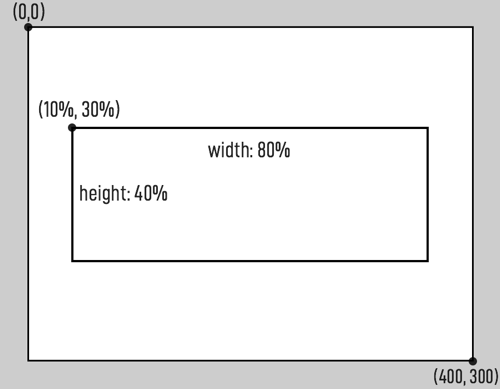
Background Example
Background section defines background color and an optional rectangle zone.
"background": {
  "bgColor": "WHITE",
  "enableButtonZone": false,
  "rectangle": {
    "strokeThickness": 2,
    "fillColor": "BLACK",
    "block": {
      "x_percent": 10,
      "y_percent": 30,
      "w_percent": 80,
      "h_percent": 40
    }
  }
}
Items Example
Items section contains one or more items, each used for rendering a TEXT, IMAGE, etc.
In the above example, two text sections are defined.
{
  "type": "TEXT",
  "data": {
    "font": "YKSZ_BOLD_44",
    "block": {
      "x": 88,
      "y": 90,
      "w": 304,
      "h": 56
    },
    "text": "{CONDITION}"
  }
}
This JSON defines a “rectangle block” in which a text string is filled into.
Background Section
A modest sample includes:
"background": {
  "bgColor": "WHITE",
  "enableButtonZone": false,
  "rectangle": {
    "strokeThickness": 2,
    "strokeColor": "BLACK",
    "fillColor": "WHITE",
    "block": {
      "x_percent": 10,
      "y_percent": 30,
      "w_percent": 80,
      "h_percent": 40
    }
  }
}
parameter |
option |
description |
bgColor |
String: color_options |
Background color of the screen (default = WHITE) |
enableButtonZone |
Bool: |
Display button area (default = false) |
Bool: |
||
rectangle.strokeThickness |
Number: 0~10 |
Border Width/Pixels (default = 0) |
rectangle.strokeColor |
String: color_options |
Border Color (default = BLACK) |
rectangle.fillColor |
String: color_options |
Rectangular Blocks Fill Color (default = WHITE) |
rectangle.block.x_percent |
Number: 0~100 |
The abscissa in the upper-left corner of the rectangular block as a percentage of the total width. (default = 0) |
rectangle.block.y_percent |
Number: 0~100 |
The ordinate in the upper-left corner of the rectangular block as a percentage of the total width. (default = 0) |
rectangle.block.w_percent |
Number: 0~100 |
The width of a rectangular block as a percentage of the total width. (default = 0) |
rectangle.block.w_percent |
Number: 0~100 |
The height of a rectangular block as a percentage of the total width. (default = 0) |
Display support from v1.25:
parameter |
option |
description |
transparentColor |
String: color_options |
Transparent color (default = OPAQUE) |
rectangle.strokePattern |
String: pattern_options |
Border pattern (default = SOLID) |
rectangle.fillPattern |
String: pattern_options |
Fill pattern for rectangular blocks (default = NONE) |
备注
Transparent color: Only valid on the tri-color screen. Assume that there are three colors of black, red, and white on the screen. If you draw a graphic first, and then draw another graphic (or text) at the same position, the specified “transparent color” content will be able to through the drawing, the content of other colors overwrites the previous picture.
备注
To upload an image on to the display node: Open Hub’s Web Portal, Click [Update Info on Displays] -> [Update] -> [Upload an Image]
Items Section
Items type
TEXT: Define the font and position for text or icons.IMAGE: Define the name and position of an image.RECTANGLE: Define the size, placement, and color of the rectangular blocks.QRCODE: Define the size and position of the QR code.BOTTOM_CUSTOM_BUTTONS: Define the captions and styles for button.BITMAP_URI: Define the uri and position of an image.
Display support from v1.25:
LINE: Define the color and length of the lines.CIRCLE: Define the color, placement, and radius of the circle.
TEXT
{
  "type": "TEXT",
  "data": {
    "text": "HELLO WORLD",
    "id": "ROOM_NAME",
    "textColor": "WHITE",
    "backgroundColor": "BLACK",
    "font": "KAUSHAN_SCRIPT_20",
    "textAlign": "RIGHT",
    "lineSpace": 0,
    "block": { "x": 0, "y": 3, "w": 272, "h": 25 },
    "offset": { "x": -8, "y": 0 }
  }
}
parameter |
option |
description |
data.text |
String |
The string to display, or the unicode encoding of the icon. (e.g., uf577) |
data.id |
String |
Parsing with JSON. |
data.textColor |
String: color_options |
Font color (default = BLACK) |
data.backgroundColor |
String: color_options |
Text Background Color (default = WHITE) |
data.font |
String: font_options |
Font Name (default = YANONE_KAFFEESATZ_44_B) |
data.textAlign |
String: |
Alignment (default = LEFT) |
String: |
||
String: |
||
data.lineSpace |
Number: 0 ~ max_height |
Line Spacing (default = 2) |
data.block.x |
Number: 0 ~ max_width |
The abscissa in the upper-left corner of the text area. |
data.block.y |
Number: 0 ~ max_height |
The ordinate in the upper-left corner of the text area. |
data.block.w |
Number: 0 ~ max_width |
Width of text area |
data.block.h |
Number: 0 ~ max_height |
Height of text area |
data.offset.x |
Pixels offset on horizontal (default = 0, range = [-128..127]) |
|
data.offset.y |
Number: -max_height ~ max_height |
Pixels offset on vertical (default = 0, range = [-128..127]) |
Display support from v1.25:
parameter |
option |
description |
data.transparentColor |
String: color_options |
Transparent color (default = OPAQUE) |
IMAGE
{
  "type": "IMAGE",
  "data": {
    "id": "LOGO",
    "source" : "BUILD_IN",
    "name" : "logo.bin",
    "block": { "x": 280, "y": 0, "w": 96, "h": 96 }
  }
}
parameter |
option |
description |
data.id |
String: Any |
Not used. |
data.source |
String: |
Logo image set via the SyncSign APP, in which case the “data.name” must be “logo.bin”, and the w,h must be 96,96. |
String: |
Image uploaded via Hub Portal. |
|
data.name |
String |
File name of logo. (In case source is |
data.block.x |
Number: 0 ~ max_width |
The abscissa in the upper-left corner of the image area. |
data.block.y |
Number: 0 ~ max_height |
The ordinate in the upper-left corner of the image area. |
data.block.w |
Number: 0 ~ max_width |
Width of image area (Must be a multiple of 8) |
data.block.h |
Number: 0 ~ max_height |
Height of image area |
Display support from v1.25:
parameter |
option |
description |
data.transparentColor |
String: color_options |
Transparent color (default = OPAQUE) |
BITMAP_URI
{
  "type": "BITMAP_URI",
  "data": {
    "backgroundColor": "WHITE",
    "foregroundColor": "BLACK",
    "transparentColor": "OPAQUE",
    "uri": "https://xxx.bmp"
    "block": {
      "x": 0,
      "y": 0,
      "w": 880,
      "h": 528
    }
  }
}
parameter |
option |
description |
data.backgroundColor |
String: color_options |
Background color (default = WHITE) |
data.foregroundColor |
String: color_options |
Foreground color (default = BLACK) |
data.transparentColor |
String: color_options |
Transparent color (default = OPAQUE) |
data.uri |
String |
URL of the image. |
data.block.x |
Number: 0 ~ max_width |
The abscissa in the upper-left corner of the rectangular block. |
data.block.y |
Number: 0 ~ max_height |
The ordinate in the upper-left corner of the rectangular block. |
data.block.w |
Number: 0 ~ max_width |
The width of a rectangular block. |
data.block.h |
Number: 0 ~ max_height |
The height of a rectangular block. |
备注
Due to the internal disk size constraint, not all the root SSL certificates are built-in. Thus, some image URI begins with HTTPS scheme will not work, please use HTTP instead. If you do need a secure transmission, please visit http://<Hub or Display Portal>/setup/certs to add the root certificates.
备注
The Wi-Fi enabled Display (e.g. 7.5-inch model) will connect to the Wi-Fi for image downloads, and please make sure the Wi-Fi network is available. It takes about 30 seconds to process the image. As for the other model (2.9-inch, 4.2-inch) without Wi-Fi built-in, the Hub will download the image and forward it to the displays via the ZigBee network, and it may take 3-5 minutes.
备注
The Hub or Display will fetch the BITMAP URL at the first time and cache it. Thus it won’t re-fetch the URL next time. If you are going to use a new image content, please modify the filename/URL, or simply use “abc.bmp?v=2” style.
How to update a picture containing black and red?
You need to separate the red and black in the picture to make two monochrome BMP pictures, and then display the images as follows.
{
    "background": {
        "bgColor": "WHITE",
        "enableButtonZone": false,
        "rectangle": {
            "block": {
                "x_percent": 0,
                "y_percent": 0,
                "w_percent": 0,
                "h_percent": 0
            }
        }
    },
    "items": [
         { "type": "BITMAP_URI",
          "data": {
            "foregroundColor": "BLACK",
            "backgroundColor": "WHITE",
            "uri": "https://file.sync-sign.com/assets/img/car_black_part.bmp",
            "block": { "x": 0, "y": 0, "w": 880, "h": 528 }
          }
         },
           { "type": "BITMAP_URI",
          "data": {
            "foregroundColor": "RED",
            "backgroundColor": "WHITE",
            "uri": "https://file.sync-sign.com/assets/img/car_red_part.bmp",
            "block": { "x": 0, "y": 0, "w": 880, "h": 528 }
          }
         }
    ],
    "options" : { "pollRate": 5000 }
}
Picture to display:
car_black_part.bmp
car_red_part.bmp
RECTANGLE
{
  "type": "RECTANGLE",
  "data": {
    "fillColor": "WHITE",
    "strokeThickness": 1,
    "block": { "x": 296, "y": 200, "w": 96, "h": 96 }
  }
}
parameter |
option |
description |
data.fillColor |
String: color_options |
Rectangular Blocks Fill Color (default = DASH) |
data.strokeColor |
String: color_options |
Border Color (default = BLACK) |
data.strokeThickness |
Number: 0~10 |
Border Width/Pixels (default = 0) |
data.block.x |
Number: 0 ~ max_width,must be a multiple of 8. |
The abscissa in the upper-left corner of the rectangular block. |
data.block.y |
Number: 0 ~ max_height |
The ordinate in the upper-left corner of the rectangular block. |
data.block.w |
Number: 0 ~ max_width,must be a multiple of 8. |
The width of a rectangular block. |
data.block.h |
Number: 0 ~ max_height |
The height of a rectangular block. |
Display support from v1.25:
parameter |
option |
description |
data.transparentColor |
String: color_options |
Transparent color (default = OPAQUE) |
data.strokePattern |
String: pattern_options |
Border pattern (default = SOLID) |
data.fillPattern |
String: pattern_options |
Fill pattern for rectangular blocks (default = NONE) |
QRCODE
{
  "type": "QRCODE",
  "data": {
    "text": "https://sync-sign.com",
    "position": { "x": 10, "y": 10 },
    "scale": 3,
    "eccLevel": "LOW",
    "version": 4
  }
}
parameter |
option |
description |
data.text |
String |
A link or displayed string that jumps after scanning a QR code.The maximum length is determined by eccLevel. |
data.position.x |
Number: 0 ~ max_width |
The abscissa in the upper-left corner of the QR code area. |
data.position.y |
Number: 0 ~ max_height |
The ordinate in the upper-left corner of the QR code area. |
data.scale |
Number: 2~6 |
The magnification of the original size (default = 4). |
data.version |
Number: 1~10 |
Determines the original size of the QR code (default = 2). The width and height of a QR code are always equal (it is square) and are equal to (4 * version + 17) * scale |
data.eccLevel |
String: |
Determines the length of data that a QR code can represent. (default = MEDIUM) |
String: |
||
String: |
||
String: |
See details of scale, eccLevel, version, https://github.com/ricmoo/QRCode
注意
Although you may increase the data.version/scale/eccLevel for a long text, as for the 4.2-inch display, If the content to be rendered as a block square area that exceeds 25600 (px*px), it may not be displayed (Due to insufficient memory when allocating the frame buffer).
LINE
Display support from v1.25.
{
  "type": "LINE",
  "data": {
    "backgroundColor": "WHITE",
    "lineColor": "WHITE",
    "linePattern": "DASH_MID",
    "transparentColor": "OPAQUE",
    "block": {
      "x0": 136,
      "y0": 50,
      "x1": 248,
      "y1": 162
    }
  }
}
parameter |
option |
description |
data.backgroundColor |
String: color_options |
Background color (default = WHITE) |
data.lineColor |
String: color_options |
Line color (default = BLACK) |
data.linePattern |
String: pattern_options |
Line pattern (default = SOLID) |
data.transparentColor |
String: color_options |
Transparent color (default = OPAQUE) |
data.block.x0 |
Number: 0 ~ max_width |
The abscissa of line starting point. |
data.block.y0 |
Number: 0 ~ max_height |
The ordinate of the starting point of the line. |
data.block.x1 |
Number: 0 ~ max_width |
The abscissa of the line end. |
data.block.y1 |
Number: 0 ~ max_height |
The ordinate of the endpoint of the line. |
CIRCLE
Display support from v1.25.
{
  "type": "CIRCLE",
  "data": {
    "radius": 40,
    "fillColor": "BLACK",
    "fillPattern": "DASH_TINY",
    "strokeColor": "BLACK",
    "strokePattern": "DASH_WIDE",
    "transparentColor": "OPAQUE",
    "backgroundColor": "WHITE",
    "strokeThickness": 2,
    "center": { "x": 104, "y": 60 }
  }
}
parameter |
option |
description |
data.radius |
Number |
Circle radius. |
data.backgroundColor |
String: color_options |
Background color (default = WHITE) |
data.fillColor |
String: color_options |
Fill color of the circle (default = BLACK) |
data.fillPattern |
String: pattern_options |
Fill pattern of the circle (default = SOLID) |
data.strokeColor |
String: color_options |
Circle border color (default = BLACK) |
data.strokePattern |
String: pattern_options |
Circle border pattern (default = DASH_TINY) |
data.transparentColor |
String: color_options |
Transparent color (default = OPAQUE) |
data.center.x |
Number: 0 ~ max_width |
The abscissa of the center of the circle. |
data.center.y |
Number: 0 ~ max_height |
The ordinate of the center of the circle. |
PERIPHERAL_CONTROL
Display support from v1.64.
{ "type": "PERIPHERAL_CONTROL",
     "data": {
       "type": "LED_RGB",
       "mode": "BLINK",
       "duration": 300,
       "pattern": {
           "RED": {"duty": 20, "period": 1000},
           "GREEN": {"duty": 0, "period": 0},
           "BLUE": {"duty": 0, "period": 0}
     }
   }
 }
parameter |
option |
description |
data.type |
String: |
Lighting control type, in this case, data.type must be LED_RGB. |
data.mode |
String: |
Lighting control mode, in this case, data.mode must be BLINK. |
data.duration |
Number |
The flashing time of the light should not be too long. |
data.pattern.RED.duty |
Number: 0~100 |
Red light brightness adjustment. |
data.pattern.RED.period |
Number |
Red light flashing interval, in milliseconds. |
data.pattern.GREEN.duty |
Number: 0~100 |
Green light brightness adjustment. |
data.pattern.GREEN.period |
Number |
Green light flashing interval, in milliseconds. |
data.pattern.BLUE.duty |
Number: 0~90 |
Blue light brightness adjustment. |
data.pattern.BLUE.period |
Number |
The blue light flashing interval, in milliseconds. |
{ "type": "PERIPHERAL_CONTROL",
    "data": {
      "type": "BUTTON",
      "mode": "PUSH",
      "buttons": [ 0, 5 ],
      "onPressed": {
        "showText": "Thank you! Please wait for a while.",
        "turnOffLed": true,
        "notifyServer": true
      }
    }
  }
parameter |
option |
description |
data.type |
String: |
Button control type, in this case, data.type must be BUTTON. |
data.mode |
String: |
Button control mode, in this case, data.mode must be PUSH. |
data.buttons |
Array: [0, 1, 2, 3, 5] |
Button number. |
data.onPressed.showText |
String |
After pressing the button, a certain text information will be displayed. The default is not to display. |
data.onPressed.turnOffLed |
Bool |
After pressing the button, turn off the LED indication, in default is disabled |
data.onPressed.notifyServer |
Bool |
After pressing the button, send the instruction to the Hub (so that the Hub can send to the server) |
备注
The those three behaviors can coexist, or only one of them can be defined. The 4 buttons of 4.2 inches and the front button of 2.9 inches all support this behavior. 7.5 inches display currently does not support this behavior. The SETUP button supports notifyServer/turnOffLed, but does not support showText (to avoid confusion). The button number for the 4 buttons of 4.2 inch is defined as 0, 1, 2, 3. The button number for the front button of 2.9 inch is 0. The number of the SETUP button is defined as 5.
The Optional Item Description
color options
BLACK: BlackWHITE: WhiteRED: Red
Available only for transparentColor
OPAQUE: All colors are not transparent.
pattern options
SOLID: SolidINTERLEAVE: Alternate lineDASH_TINY: Small size dotted lineDASH_MID: Medium size dotted lineDASH_WIDE: Big size dotted lineNONE: Hollow
max width
2.9 Inch Display:
2964.2 Inch Display:
4007.5 Inch Display:
880
max height
2.9 Inch Display:
1284.2 Inch Display:
3007.5 Inch Display:
528
font options
English Characters
DDIN_16,DDIN_24,DDIN_32,DDIN_48,DDIN_64,DDIN_128:

DDIN_CONDENSED_16,DDIN_CONDENSED_24,DDIN_CONDENSED_32,DDIN_CONDENSED_48,DDIN_CONDENSED_64:

CHARRIOT_10:

APRILSANS_10,APRILSANS_16,APRILSANS_24:

ROBOTO_CONDENSED_24,ROBOTO_CONDENSED_48:
ROBOTO_SLAB_24,ROBOTO_SLAB_48:
YANONE_KAFFEESATZ_24_B,YANONE_KAFFEESATZ_44_B:
KAUSHAN_SCRIPT_20,KAUSHAN_SCRIPT_32:
SRIRACHA_24:
DORSA_32:
LONDRINA_OUTLINE_36:
BUNGEE_SHADE_36:
Chinese Characters
only support 4MB Flash Display
NOTO_SERIF_16:
这是一段中文字符
NOTO_SANS_24,NOTO_SANS_40:
这是一段中文字符
Text escape
Only supported by Hubs above v0.5.0
<SN>: Serial number of the hub.<NODE_ID>: The id of the display currently using this template.
Example of <NODE_ID> Usage in the QRCODE:
{
  "type": "QRCODE",
  "data": {
    "text": "https://sync-sign.com/<NODE_ID>",
    "position": { "x": 10, "y": 10 },
    "scale": 3,
    "eccLevel": "LOW",
    "version": 4
  }
}
Icon
ICON_WEATHER: https://erikflowers.github.io/weather-icons/ICON_FA_SOLID: https://fontawesome.com/icons?d=gallery&s=solidICON_FA_BRANDS: https://fontawesome.com/icons?d=gallery&s=brands
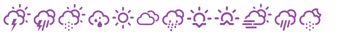
Some of the icons for ICON_WEATHER are as follows, (The Unicode code is next to the icon.)
Some of the icons for ICON_FA_SOLID and ICON_FA_BRANDS are as follows. For more icons, please click at the link above.
Click on the icon to see the Unicode encoding of the icon, as shown“ f069” in the figure below. If the Unicode is incorrect, it will display a random icon.
Example of Icon Usage in the Json
{
  "items": [
      { "type": "TEXT",
        "data": {
          "text": "\uf002\uf0c8\uf071\uf03d",
          "id": "ICON_WEATHER_EXAMPLE",
          "font": "ICON_WEATHER",
          "block": { "x": 0, "y": 0, "w": 272, "h": 70 },
          "offset": { "x": 4, "y": 0 }
        }
      },
      { "type": "TEXT",
        "data": {
          "text": "\uf073\uf556\uf188\uf2bb",
          "id": "ICON_FA_SOLID_EXAMPLE",
          "font": "ICON_FA_SOLID",
          "block": { "x": 0, "y": 70, "w": 272, "h": 40 },
          "offset": { "x": 4, "y": 0 }
        }
      },
      { "type": "TEXT",
        "data": {
          "text": "\uf073\uf270\uf642\uf17c",
          "id": "ICON_FA_BRANDS_EXAMPLE",
          "font": "ICON_FA_BRANDS",
          "block": { "x": 0, "y": 110, "w": 272, "h": 40 },
          "offset": { "x": 4, "y": 0 }
        }
      }
  ]
}
Options Section
Options Available:
pollRate: (deprecated) Update the node’s poll rate to this value (milliseconds)refreshScreen: Whether to refresh the screen at the end of rendering
Poll Rate (deprecated)
Valid range: 100 to 25,000 (milliseconds). Default: 10,000.
To save energy, the display node will poll the Hub for new instructions every N seconds. The default poll rate is 10 seconds.
However, you can change this rate for demonstration or other purposes. Remember, the shorter rate, and the more energy consumes, we suggest a rate larger than 1000 (1 second).
Refresh Screen
Valid value: true / false. Default: true.
E-ink screen will get messy after a few “partial” updates. To ensure a clean screen, it should do a refresh after all the information rendered. However, you can disable it by setting this option to false.
备注
The ‘background’ section will do to a refresh of the screen. If you just need to update a part of the screen with a refresh blink, remove the whole ‘background’ section from the template.
Limitations
Please use white text on a red background instead of black text or other combinations.
At least one of h and y must be a multiple of 8 in the
TEXTblock.In
CIRCLE, ifstrokeColorisWHITE,fillColorcan take effect; ifstrokeColoris notWHITE, thenfillColormust be equal tostrokeColor, if not, fill according tostrokeColor;In
BACKGROUND, if rectangle fill isWHITE+SOLID, you will get all black effect; you must useWHITE+NONEto turn the middle to white.Single block area may be too large to be displayed.
2.9-inch limitation: When drawing the
background,fillColor, andbgColorIf one isRED, the other can only beRED.
备注
The SyncSign system will automatically merge the events information from a calendar into the template, then send it to the displays. Please read this for details Template for Calendars.
备注
If you are calling the SyncSign API to render the display, please submit the template document described above. If you are customizing the template for your calendar events, please read Apply the Template to Your Displays.